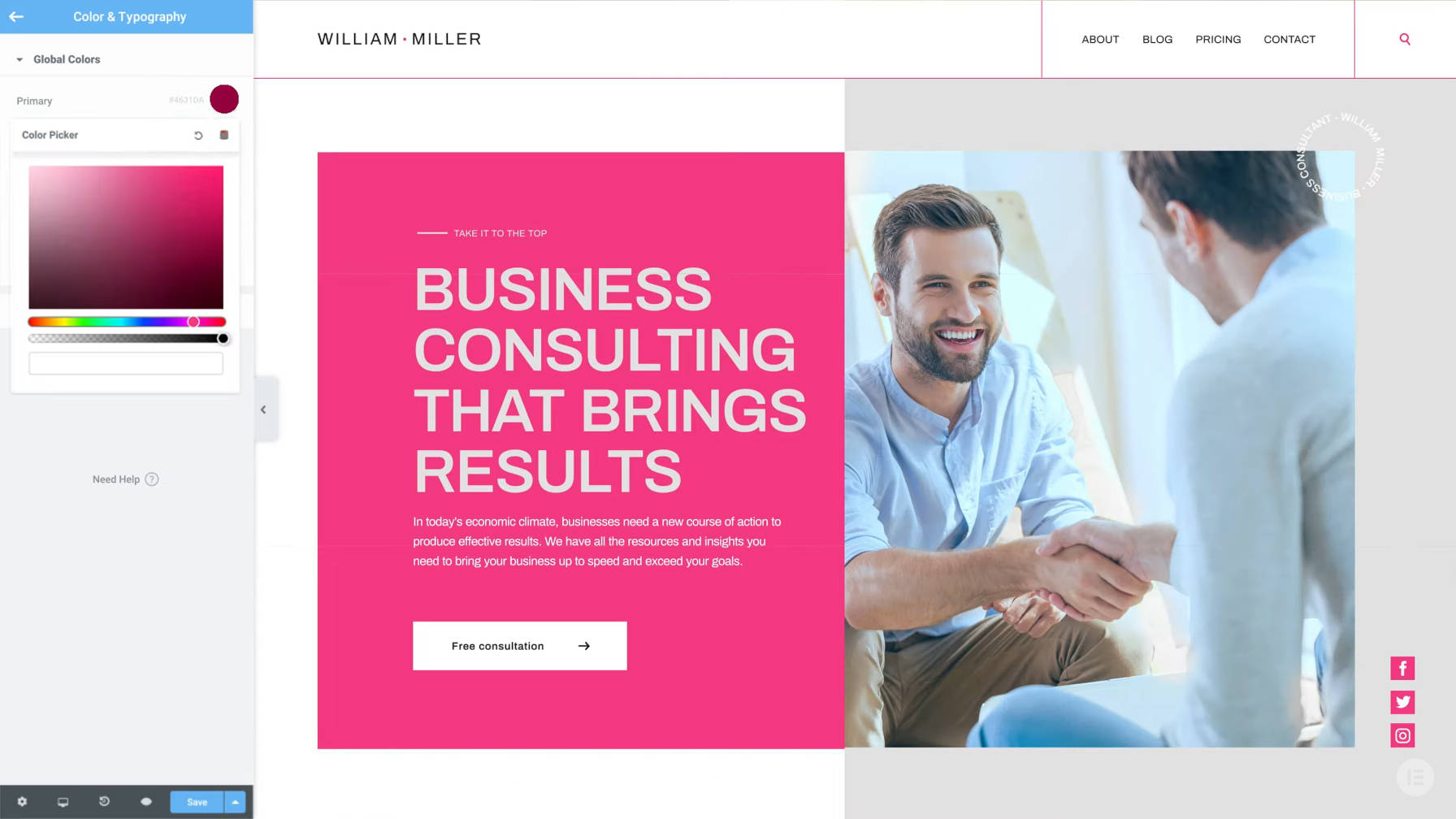
Elementor 3.0 Allows Users to Create a Personalized Design System
Elementor version 3.0 was launched on Tuesday. This release is the first major update to the plugin in over two years and is one of the largest upgrades in its history. The new version focuses on a design system, a new theme builder, and performance improvements. The driving motivation behind this release was to create global design tools, which is a shift from the plugin’s roots as a mere page builder.
One of my biggest complaints about builder plugins is that they have often approached design on the individual page level first. However, web design is not about how you can fancy up a page. It is about taking a holistic approach to the overall design of the site. When building single pages, users of such plugins far too often create more work for themselves, much of it better handled on a global scale. One of the cornerstones of development is to not repeat work you have already done. Builder plugins can too easily push those who use them toward such bad habits.
Design should handle the foundational, global features first. Then, drill down to the atomic level when necessary. Builder plugins have almost exclusively gotten this backward in the past.
Elementor 3.0 seeks to solve this problem by introducing its design system and a new theme builder. The latter is part of its pro offering. The design system is essentially a global style creator and is available in both the free and pro versions. This is a welcome addition to the plugin and should create a solution for those foundational elements that the plugin has been missing.
“Creating a site with a design system in mind (i.e. style guide, colors, and typography) is how professionals approach building websites,” said Ariel Klikstein, the co-founder and CTO of Elementor. “For many creators, this is an integral part of building the site as it helps them, their teams, and their clients to align and communicate around a consistent vision.”
The Elementor team is coming to terms with the principles that have long guided web designers. The goal is to apply these principles to a user interface, breaking outside the confines of code.
“Design system capabilities are among the pillars of building professional websites, as they give the ability to view and control the site elements from a centralized hub and apply sitewide changes to overall colors, typography, and layout,” said Klikstein.
Elementor’s Design System

Elementor is pitching its new design system as revolutionary. However, such design systems have long existed in the WordPress ecosystem. Theme developers have created similar systems for well over a decade, and they have since capitalized on WordPress’s built-in customizer to do it in real time.
The question is whether this new system ups the ante, creating a new baseline in which others must compete.
That will be for users to decide. However, it does offer a plethora of options under its Site Settings menu. It allows end-users to customize colors, typography, and several other elements across the site. Current plugin users will have tools in their hands to do some more amazing things with Elementor, and they will be able to do them in a much more streamlined manner. Ultimately, it should save time and make it possible to update the site over the long term without re-editing old work.
It is not particularly revolutionary, but it is something that should be standard for any sort of visual design system.
“While it’s true that applying global styles was always possible using custom CSS code and themes, in Elementor V3.0 we made these options truly global,” said Klikstein. “Today they are independent of a theme, plugin, or widget as part of the element-based web design paradigm. The design system features are integrated into the editor workflow, without the need to use a single line of code. This will let the user implement global colors and fonts across any site element — be it a button, heading, or background. Then, if the user decides to change the color or a font style, he or she can change it once and apply it wherever it was previously placed in the global setting.”
To not mislead readers, note that most themes that have implemented such systems have also not required custom CSS or other code.
Perhaps the bigger question is whether this new design system will be better than the upcoming global styles feature in Gutenberg and core WordPress. The aims of the two are similar, but WordPress will undoubtedly launch its feature with a much more limited set of options. WordPress will also need buy-in from theme authors.
Klikstein did not directly respond to the question of how WordPress’s global styles feature impacted any decision that went into Elementor’s design system feature. However, when cutting through the marketing cruft, he did say, “It’s great to see that Gutenberg/WordPress is also moving in this direction because we believe this is the best way to create consistent and maintainable websites.” He also said this feature was on the roadmap since the plugin’s earlier theme builder concept.
Gutenberg may not be much of a consideration for Elementor’s development team. They are clearly carving their own path to success and outpacing others in the race to building websites through a visual interface.


