FSE Outreach Round #6: Building a WordCamp Landing Page via the Template Editor
As has almost become ritual at this point, I am always looking forward to the next testing round for Full Site Editing (FSE). Spearheaded by core contributor Anne McCarthy, the FSE Outreach Program’s fortnightly user tests are usually fun and offer everyone a chance to get involved, regardless of their experience level.
This latest testing round is all about whether users can create a custom template on a per-post basis directly from the editor. The answer? Why, yes, they absolutely can.
Round #6 asks for volunteers to use the new template-editing mode, which is expected to land in WordPress 5.8, to build a WordCamp landing page. The goal is to offer a discount code and attract attendees from another event to join.
Anyone interested in discovering issues and providing feedback should give this testing round a shot. There is a 36-step guide that will walk you through building a custom landing page. It should take no more than 15 minutes, maybe more if you are putting a unique spin on the design — that is half the fun for me.
Feedback is open through May 26. Just follow the instructions and leave a comment on the post.
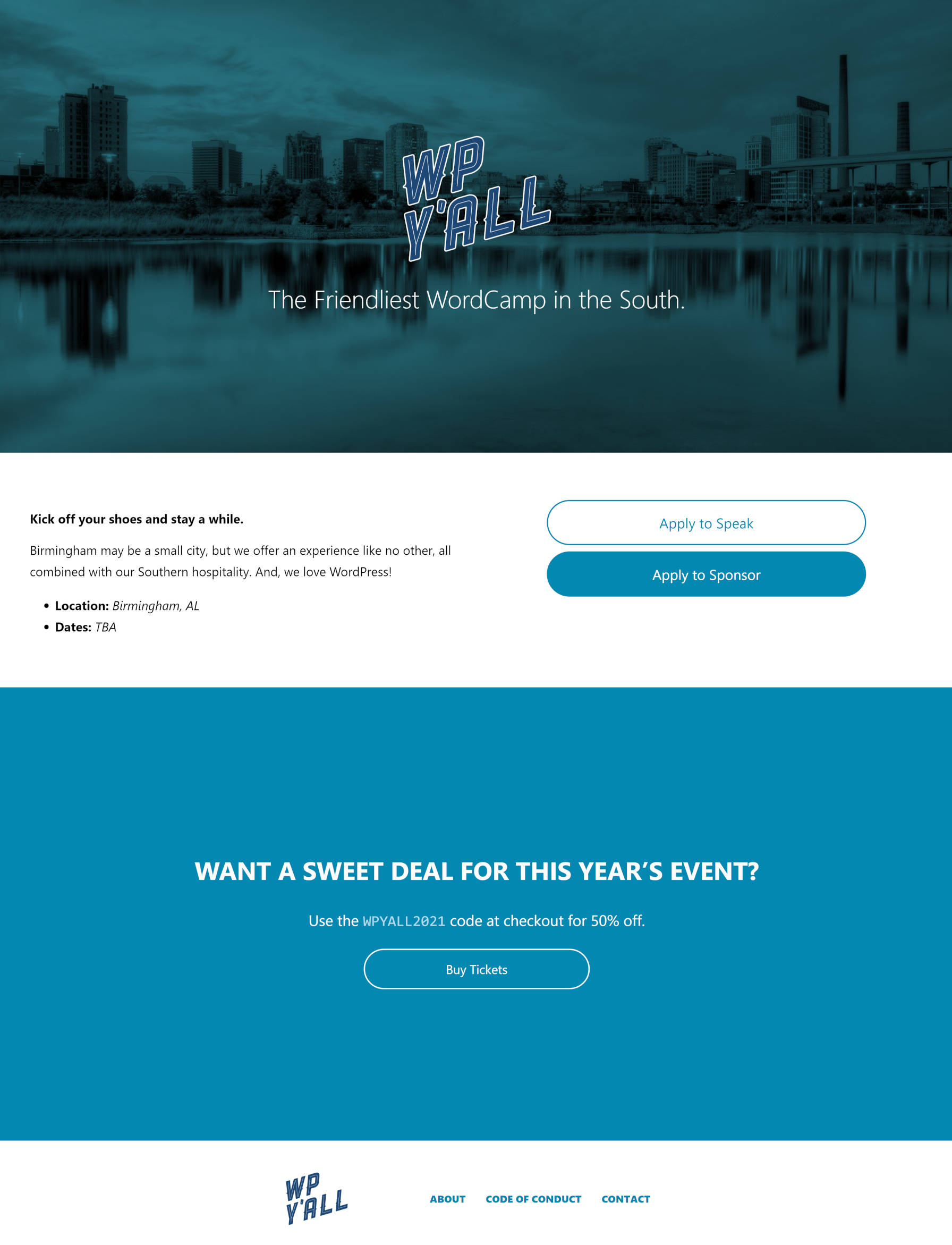
The closest thing to a local WordCamp I have is Birmingham, AL, known for its “WP Y’all” name. I am hopeful that the WC Birmingham team would not mind me borrowing their logo for this experiment. The following is the WordCamp landing page I built with the TT1 Blocks theme:

Other than the known Nav Menu block issue noted in the post, I ran into no technical problems with any of the 36 steps. Everything worked as expected. However, that does not mean that everything was perfect.
Problems, Mostly Trivial
Before diving into the actual user-experience issues with building templates, I noticed a problem with the custom template system. After finishing the testing round, I wanted to see what my template looked like with other themes. However, I could not do this. Upon activating another theme, my custom template seemed to disappear.
The problem is that custom templates are tied to the theme. I see the logic in this. Certain aspects could be specific to the active theme (colors, fonts, etc.), and it is always how custom templates have worked. However, the block template system is different. From a user viewpoint, I feel like my custom-created templates belong to me rather than the theme.
I can see a user switching themes after a couple of years and building a dozen or so templates having a poor experience in this situation. If the feature remains the same, there should be more clarity.
One of the more frustrating aspects of the template editor is the lack of space at the bottom of the frame. I am accustomed to the post editor’s extra whitespace, focusing the active workspace toward the top of the screen.

I just want to put the current piece of the layout I am working on higher up the page. I am not sure how this would look when dealing with a template editor because it needs to clearly mark the end of the document.
The other issues were primarily around the TT1 Blocks theme or missing features with the current Gutenberg plugin.
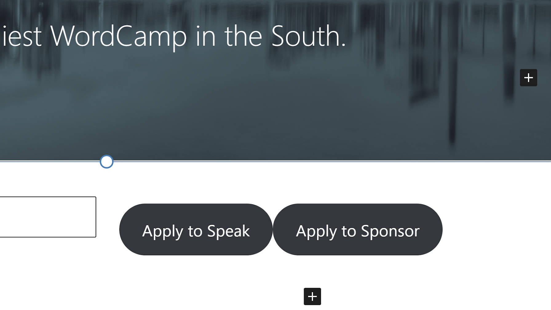
When adding a horizontal Buttons block, there is no space between individual buttons. Vertical alignment is better, but it could use a slight bump (on the front end, not in the editor).

And, I feel like I cannot be the first to say this: I am ready for Button block padding controls so that I can adjust TT1 Blocks’ abnormally large button output.
When inserting a full-width Columns block, the text on the left butted against the side of the page. Because neither the Columns nor the inner Column blocks currently have padding controls, the only way for users to “fix” this is to add a background color. Gutenberg automatically adds padding in that case.

The last trivial fix I had to make was adding a Spacer block above the custom footer section. This was not included in the testing instructions. Without it, the footer had no spacing between it and the content above it.
I did question one aspect of the testing instructions. Templates are generally a sort of wrapper or design layout. Content is a separate thing that typically lives independently. In this test, the content is housed within the template. There are scenarios where the test case makes sense. However, I would have preferred a flow where the content portion of the template was a part of the post and output via the Post Content block.
That sort of moving back and forth between post and template editors may have opened up some more usability hangups that would be worth exploring.


