Gutenberg 10.7 Integrates With the Pattern Directory, Introduces New Block Design Controls
관련 글: 소문난 상품 트라이크 추천 10
Gutenberg 10.7 landed yesterday. Within a few hours, the development team also released version 10.7.1 of the plugin with a few bug fixes. The latest update primarily focuses on work expected to land in WordPress 5.8 this July.
The feature freeze deadline for the current WordPress development cycle passed on Tuesday. This should mean that no new features beyond Gutenberg 10.7 will make it into the core platform. WordPress 5.8 Beta 1 is slated for June 8.
This release feels like the team has polished the interface and experience for the better. Users can also look forward to several enhancements, such as additional block design options.
Block Pattern Directory Integration
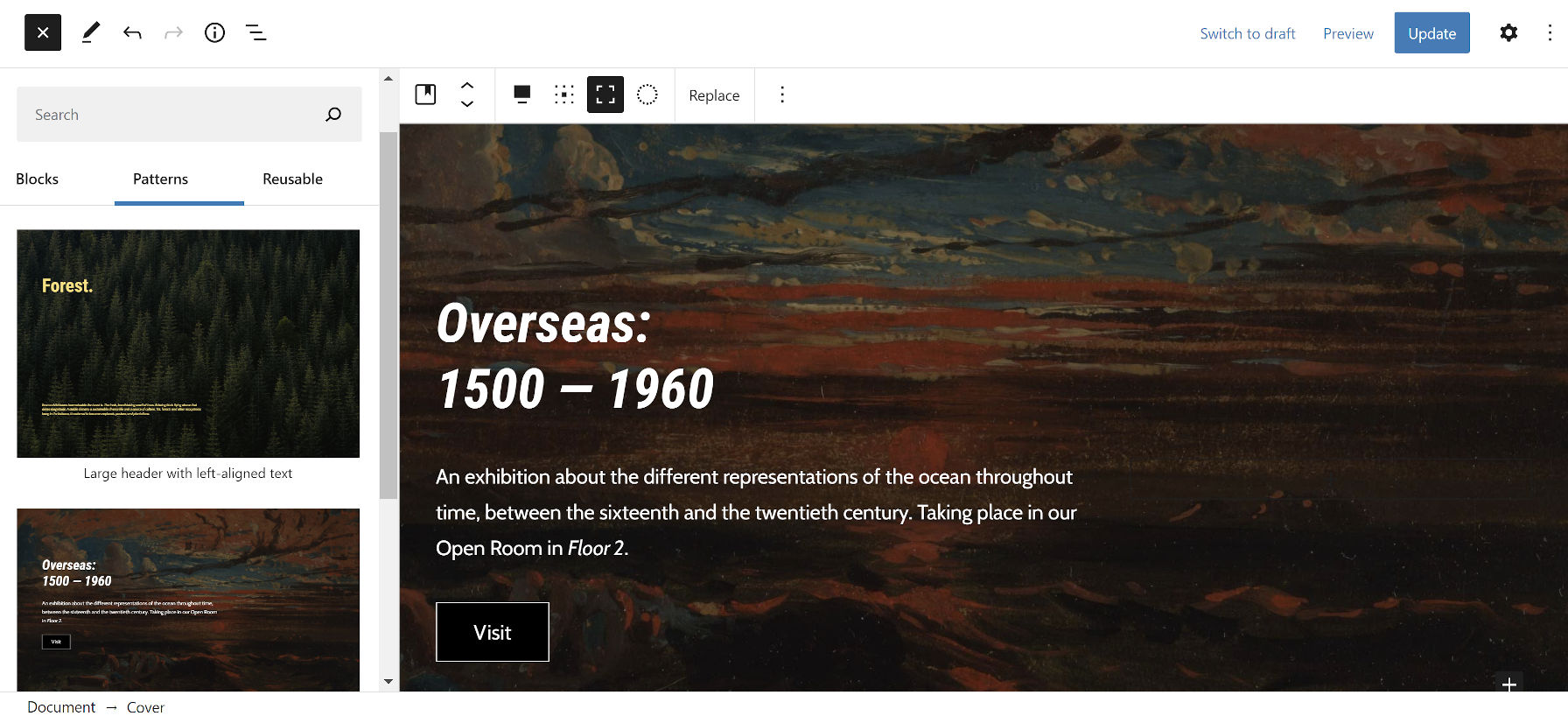
Gutenberg now serves its default block patterns via the pattern directory on WordPress.org. This moves their development outside of the plugin and core WordPress, which means designers can iterate on them without a user needing to update. They will always have the latest version available from the editor.

The pattern directory will be a handy tool for end-users. For many, it will likely serve as a path toward building more complex layouts in the WordPress editor. At the moment, it only houses 10 patterns. This will change after it is opened to community submissions.
Shaun Andrews shared some of the ongoing design work for the directory, and it is beautiful. I am eager to see the final result when it launches.

A side note about block patterns: there is currently a bug that may cause some of those bundled with themes to not appear in the inserter.
New Block Design Controls
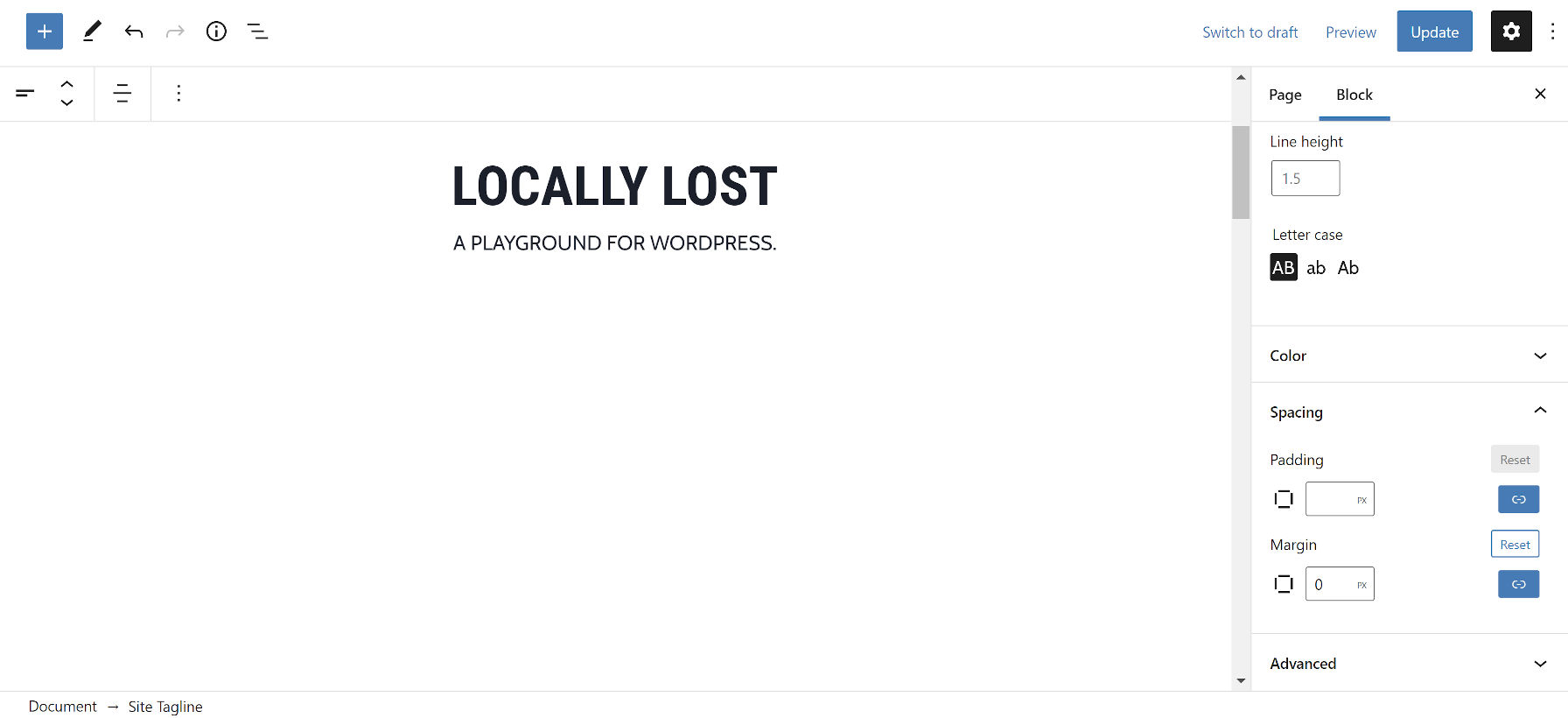
Version 10.7 introduces several new design controls for blocks. The most exciting feature for many will be margin controls for more precise control over spacing. Theme authors must set the settings.spacing.customMargin key to true in their theme.json files to enable this.
Currently, only the Site Title and Site Tagline blocks support margin controls. However, now that the initial feature has landed, we should expect others to follow suit in future versions.

The Site Title block also has letter case typography controls.
The development team upgraded the Column block with a couple of new options. Users can now customize the padding and colors for individual columns.

One of the more low-key enhancements happens to be one of my favorite changes. The Media & Text block received a new “media width” block option in the sidebar. This makes getting the correct width a far better experience than using the drag handle in the content canvas.

I may begin using this block more now. I had been shying away from it for any use case beyond the default width settings.
관련 글: 투명정리함 할인 상품
Another welcome enhancement is Cover being added as a transform option for the Group block. It will only appear if the block has a background.
Template Editor Welcome Guide

Template-editing mode will be one of the most highlighted features for WordPress 5.8. It allows users to switch from content to template editing while never leaving the post screen. Therefore, users will need a welcome guide to explain the new feature.
Currently, the message reads:
Welcome to the template editor
Templates express the layout of the site. Customize all aspects of your posts and pages using the tools of blocks and patterns.
It is a solid starting point, but it does not fully explain what this mode is about. I expect the development team to smooth it out a bit, maybe add an extra slide or two, or even link to a dedicated documentation page on WordPress.org. Helping users set off on the right foot with this new feature should mitigate confusion and lower the support burden.
There is currently an open call for volunteers to provide feedback on the template editor while building a portfolio-type landing page (see my results). Make sure to get involved if you can spare half an hour or more.
Buttons Block Uses column-gap

This is more of a theme developer note, but some users may have noticed lines of buttons not extending to the edge of their container. In certain situations, at least.
Essentially, the space between individual Button blocks used a bit of a hacky, old-school CSS margin solution to create the gutter space between each. In the modern world of flex and grid layouts, it is something most designers dread seeing. It overcomplicates things and makes for more bloated CSS, particularly if you want to make adjustments based on screen size.
I am highlighting this change because it is one of those stages where the block system is becoming more polished under the hood. And, it could be the start of more exciting things to come for theme authors.
“This is great, this is beautiful, themers are going to love it,” wrote Joen Asmussen in the ticket. “At some point once the dust settles, we should see if this gap could become a global styles property; since it’s so easy to change and resilient, it would be nice to handle in such a neat way.”
It is a welcome sight to see the use of column-gap land in the plugin. Of course, it could use row-gap for vertical spacing instead of margins in those cases where Buttons extend beyond a single row.
Now, can we do the same for the Columns, Gallery, and Query Loop blocks? Normalizing the system for gutters/gaps between flex items can save dozens upon dozens of lines of code in the long term.
관련 글: 특_가 물티슈밀대 추천 상품 10


