Gutenberg 11.2 Expands Color Support for Search and Pullquote Blocks, Introduces Experimental Flex Layout for Group Block
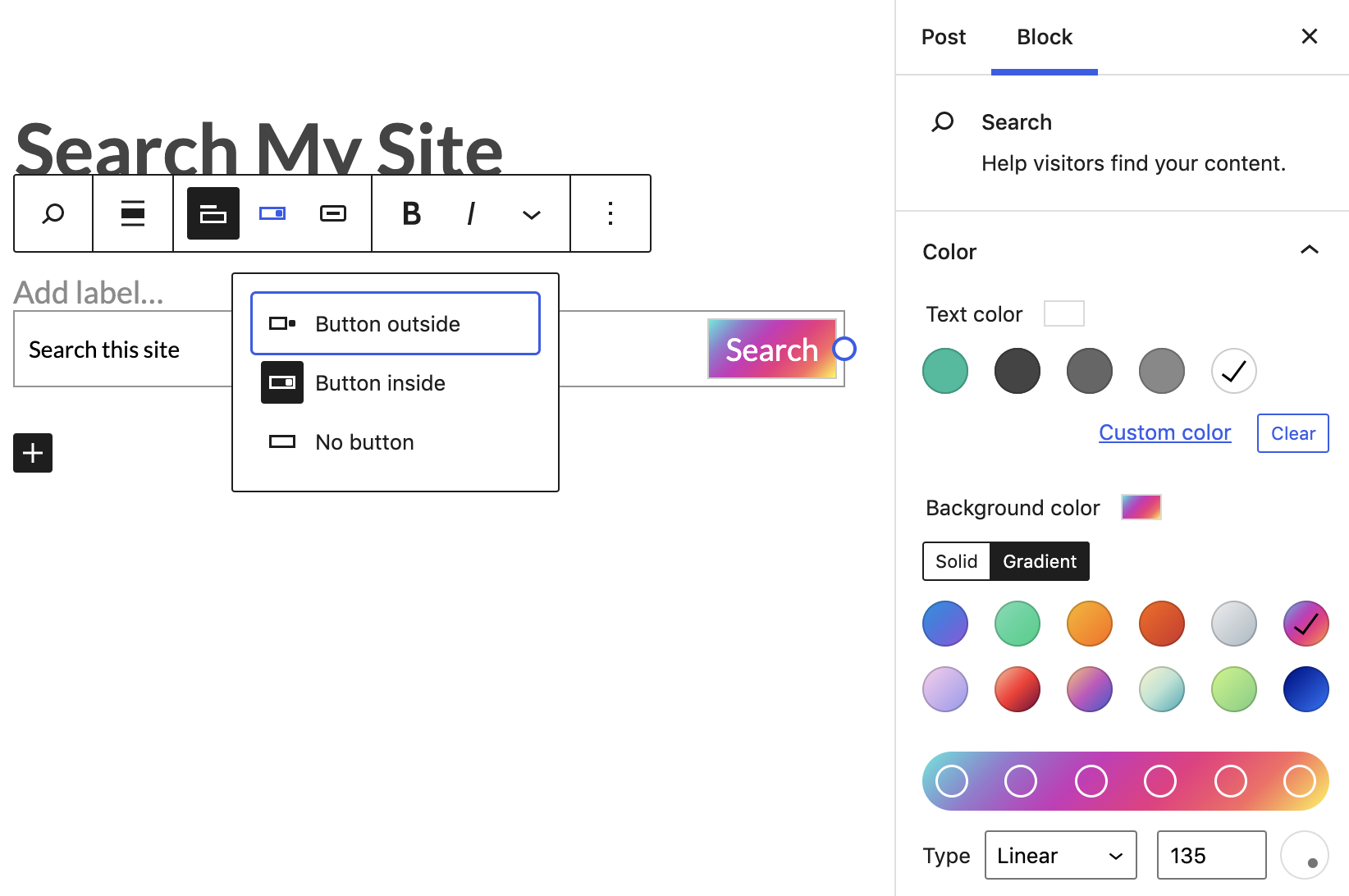
Gutenberg 11.2.0 was released today with expanded color support for the Search and Pullquote blocks. Historically, customizing these elements has been out of reach for most users if their themes didn’t include them as options. This release introduces color support and border color support for the search button.

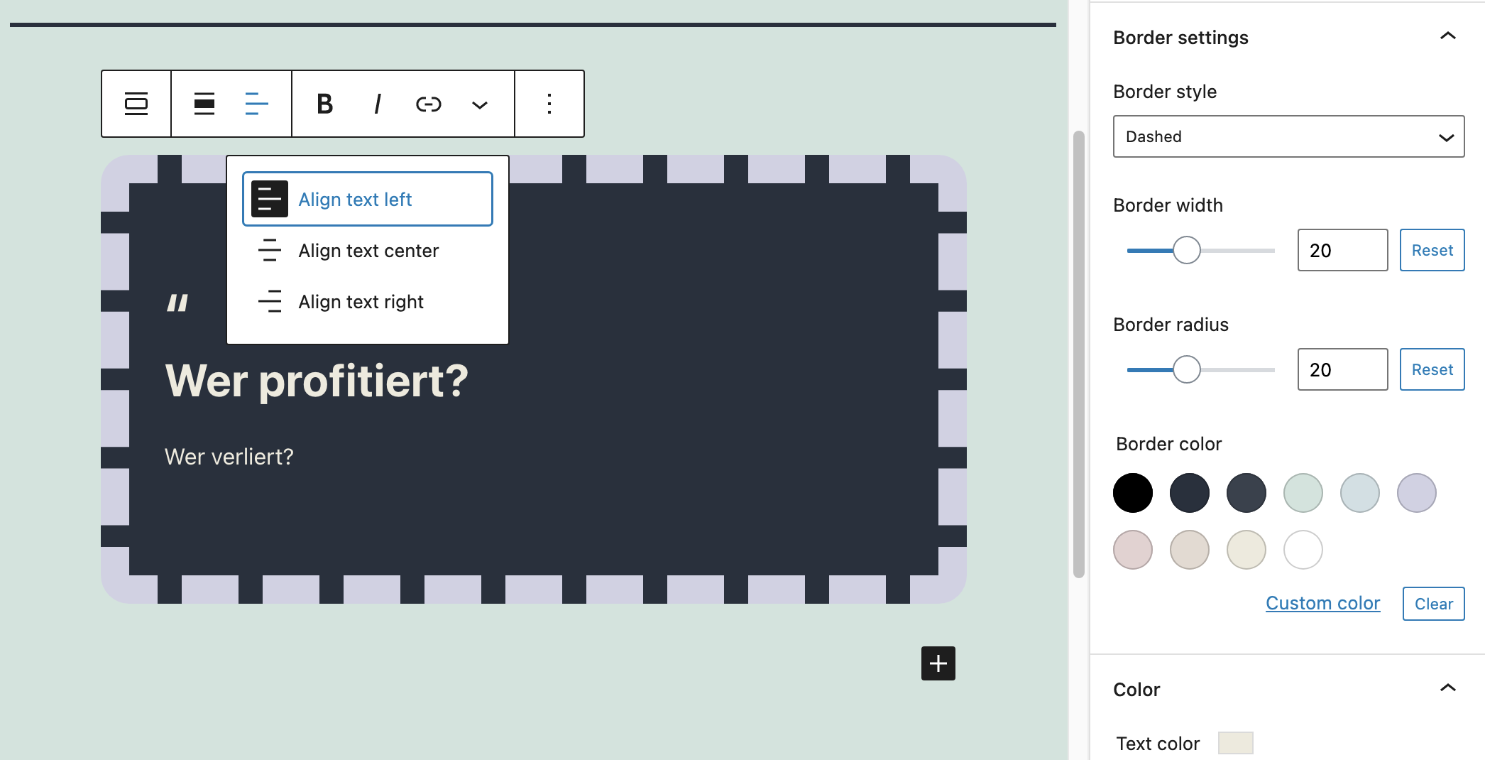
Pullquotes are getting a similar treatment with border and color support, enabling some creative design options for those who enjoy taking the reins on customization.

It’s these kinds of minute style changes that web developers would have been paid to perform back in the earlier days of theme customization gigs. Now the block editor enables anyone to jump in and do it themselves.
These color support additions are part of a larger effort to improve the editor’s design tools to provide consistent application across blocks.
“Another important goal of design tools is ensuring a wide range of exquisitely crafted patterns are possible; that best practices are not only possible but encouraged; and that customizing blocks is a consistent and natural experience,” Gutenberg Lead Architect Matias Ventura said in the ticket tracking design tool tasks.
Gutenberg 11.2 also introduces support for a new experimental flex layout. The need for additional layouts was described by Rick Banister in a ticket submitted a year ago, requesting a “display horizontal” option for the Group block:
When building patterns or trying to achieve a layout with multiple elements arranged horizontally it would help to have a parent block that would automatically arrange its children on a single line. Columns can be used to arrange things side-by-side, but they add quite a lot of extra nesting if you only need to arrange one set of blocks.
We could leverage the Group block and add a ‘display horizontally’ or ‘act as a row’ option to it. It would wrap its children and act as a ‘flex container’ (
display:flex; flex-direction:row;). Furtherflexparameters could be optional to align and distribute objects.
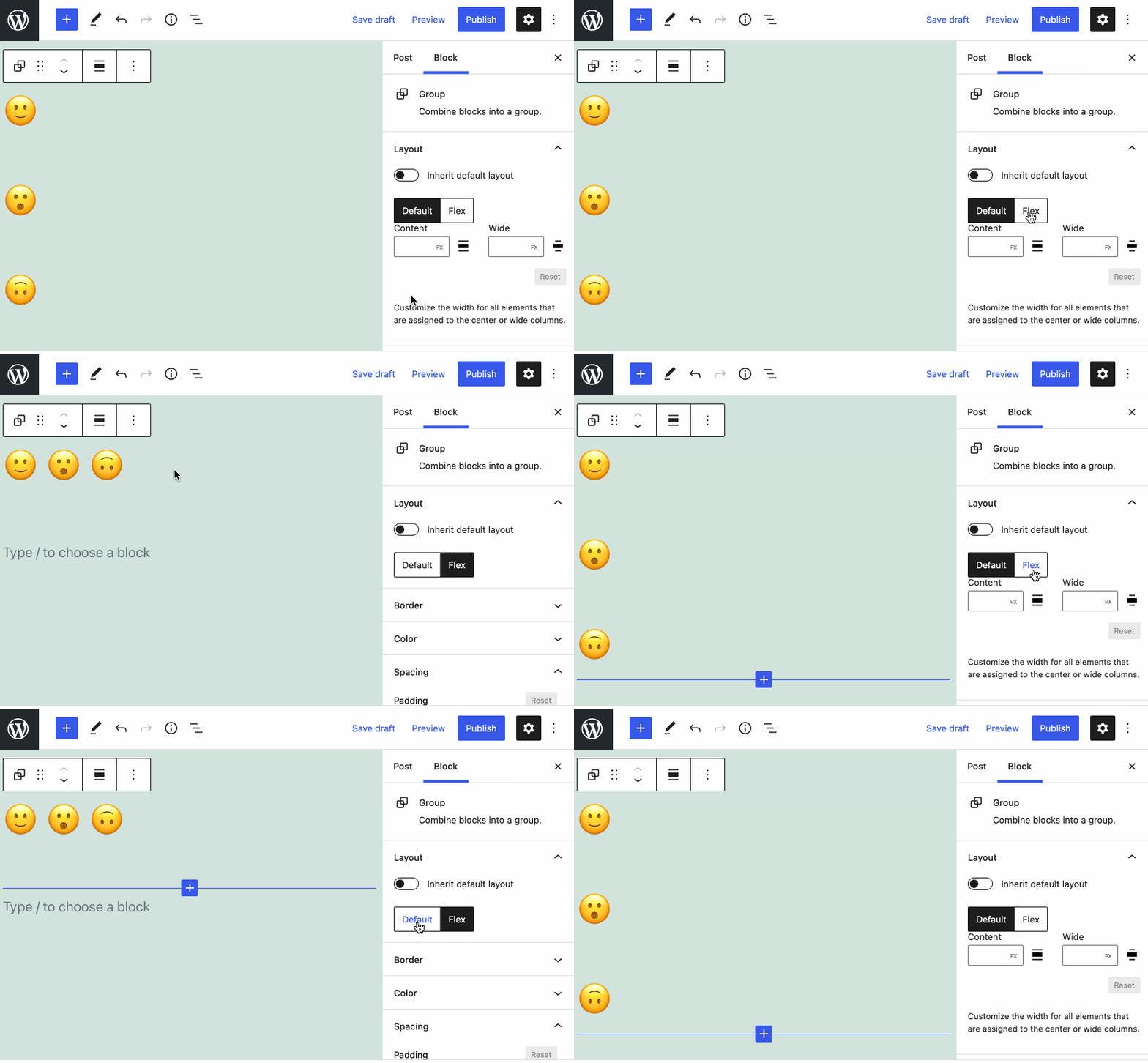
A flex layout option has the potential to remove some of the complexity in nesting blocks. This early prototype shows a rough, unfinished UI for a layout switcher. It shows the difference between a flex layout and the default “flow” layout, which displays children one after the other vertically without any specific styles. The PR included in Gutenberg 11.2 makes it possible for blocks to support multiple layouts. Gutenberg engineer Riad Benguella said the plan is to introduce more layouts, such as “grid” and “absolute positioning container.”

Adding “flex” layout support for the group block is the first step towards proving how multi-layout options can work in the block editor.
“In the previous WordPress release, we introduced the layout config and the __experimentalLayout prop for inner blocks,” Benguella said. “The initial reason for these was to make alignments and content widths more declarative for themes. While this was an ambitious goal on its own and a hard one to achieve for the default layout, the goal has always been to absorb and support more kinds of layouts in the editor than the regular vertical list of blocks.”
This experimental flex layout support can be useful for theme developers and makes sense in certain use cases with the Cover block, headers, social icons, columns, and other applications. The layout switcher UI is hidden in this release while the Gutenberg team works on a better design and wording for the feature.


