Gutenberg 8.2 Includes Editing Flow Improvements, Cover Block Content Positioning, and Pattern Categories
On Wednesday, the development team behind Gutenberg dropped version 8.2 of the plugin. The new release focuses on a better editing flow, includes a new content positioning control for the Cover block, and adds categories to block patterns.
With this release, users can copy an entire block via the Ctrl + C keyboard shortcut or cut a block with Ctrl + X if no specific text is selected. The snackbar popup will appear at the bottom of the screen to show which block was copied.
Hitting the Enter key while editing an image caption will create a new paragraph. For situations where a user wants to continue writing after inserting an image and caption, this is probably a welcome addition. However, it could be a problem for users who need to have multi-line captions — I am uncertain how to add a line break in a caption with this change.
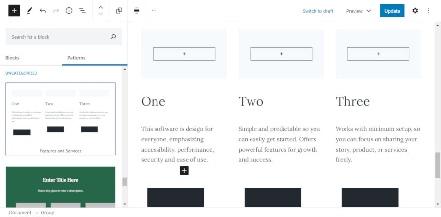
Gutenberg 8.2 includes several other enhancements, such as limiting the most-used blocks in the inserter to six items. Individual buttons within the Buttons block can be split into two buttons by hitting the Enter key or merged by hitting the Backspace key. Users can also test two new block patterns. One adds a hero section with two columns beneath. The other adds a three-column features/services section.
Overall, this is a solid update with numerous enhancements and bug fixes. The editing flow changes are nice improvements, and the new Cover block positioning and Patterns API updates are welcome additions to the editor.
Content Positioning for the Cover Block

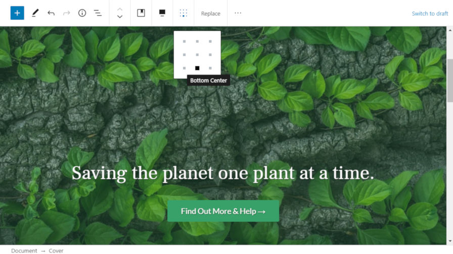
The Gutenberg team has created a new alignment control that allows end-users to position the content within the Cover block. I have been waiting for this feature for at least a year after first seeing it mentioned as a possibility in an unrelated ticket.
The new positioning feature adds a matrix control with nine positions the user can choose from. Once a position is chosen, the inner content of the Cover block will move to that location. It is important to note that some content will not look like it has changed position if the Cover block is full. The inner container’s width is set to auto, which means the content inside may already be taking up all the available space. Alignment is more pronounced in Cover blocks with less content inside.
Sure, it was possible to align inner blocks individually in past versions of the plugin. However, it was also sometimes a bit of pain to do on the block level. This new control brings a new level of flexibility to the Cover block.
Theme authors will need to update the CSS in their themes to handle the new positioning classes. There does not seem to be any official documentation for styling these classes, so looking at the source code is the best course of action. The classes are as follows:
.has-custom-content-position.is-position-top-left.is-position-top-center.is-position-top-right.is-position-center-left.is-position-center-center.is-position-center-right.is-position-bottom-left.is-position-bottom-center.is-position-bottom-right
It will also be interesting to see what plugin developers do with the new AlignMatrixControl component for their own blocks. This component is used for handling the inner block alignment of the Cover block, but it should be easy to extend to other blocks that could also use such alignment.
Categories for Patterns

Gutenberg 8.2 has nearly ticked all my boxes for the Patterns API. The newest release adds support for categorizing patterns. Currently, the default interface shows the following seven categories:
- Text
- Hero
- Columns
- Buttons
- Gallery
- Features
- Testimonials
There is also an “Uncategorized” section at the bottom of the inserter, but it is not technically a category. It merely houses any patterns that have not been categorized.
Theme and plugin authors now have access to the register_block_pattern_category() and unregister_block_pattern_category() functions to register or unregister patterns, respectively. Categories can be assigned to a specific block via the new categories argument. More information is available via the Patterns API documentation.
Patterns can be assigned one or multiple categories. Therefore, users may see duplicates of some patterns in the inserter. This is one reason I am holding out hope for the team to bring the tabbed interface or something similar back to the inserter. With categories, that should now be possible for both blocks and patterns. At the moment, my library of patterns is becoming unwieldy.
Slash commands for patterns are still on my wish list, which may cancel the need for a tabbed inserter interface.
Block Widgets Almost Ready

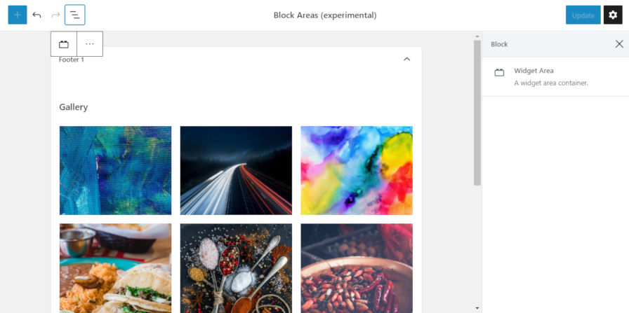
In this week’s editor chat, the team discussed the possibility of bringing the new Widgets screen out of the experimental stage. If this happens before July 7, it could mean users might be able to start configuring their sidebars with blocks as early as WordPress 5.5. This is not set in stone yet, but it is exciting to start seeing blocks truly break out of the post content area.
For the most part, the block-based widgets system works well. It does not yet feel as polished as it should be for merging into core WordPress. However, if the team pushes through any remaining roadblocks in the next month, it is within the realm of possibility. I have my doubts, but we’ll see where this lands soon.
Now is a good time for end-users to begin testing the experimental widgets via both the “Widgets (beta)” admin screen and the “Widgets Blocks (Experimental)” customizer panel. To test this feature, enable the Widgets option under the Experiments settings page for the Gutenberg plugin.


