Gutenberg 9.1 was released to the public on Wednesday. The team announced over 200 commits from 77 contributors in its release post yesterday. One of the biggest changes to the interface was the addition of a new dropdown selector for block pattern categories. The team also reverted the block-based widgets section in the customizer and added an image size control to the Media & Text block.
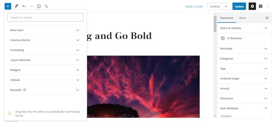
One of the main focuses of this release was improving the block-based widgets editor. The feature was taken out of the experimental stage in Gutenberg 8.9 and continues to improve. The widgets screen now uses the same inserter UI as the post-editing screen. However, users can currently only insert regular blocks. Patterns and reusable blocks are still not included.
Theme authors can now control aspects of the block editor via a custom theme.json file. This is part of the ongoing Global Styles project, which will allow theme authors to configure features for their users.
The development team has also added an explicit box-sizing style rule to the Cover and Group blocks. This is to avoid any potential issues with the new padding/spacing options. Theme authors who rely on the block editor styles should test their themes to make sure this change does not break anything.
Better Pattern Organization

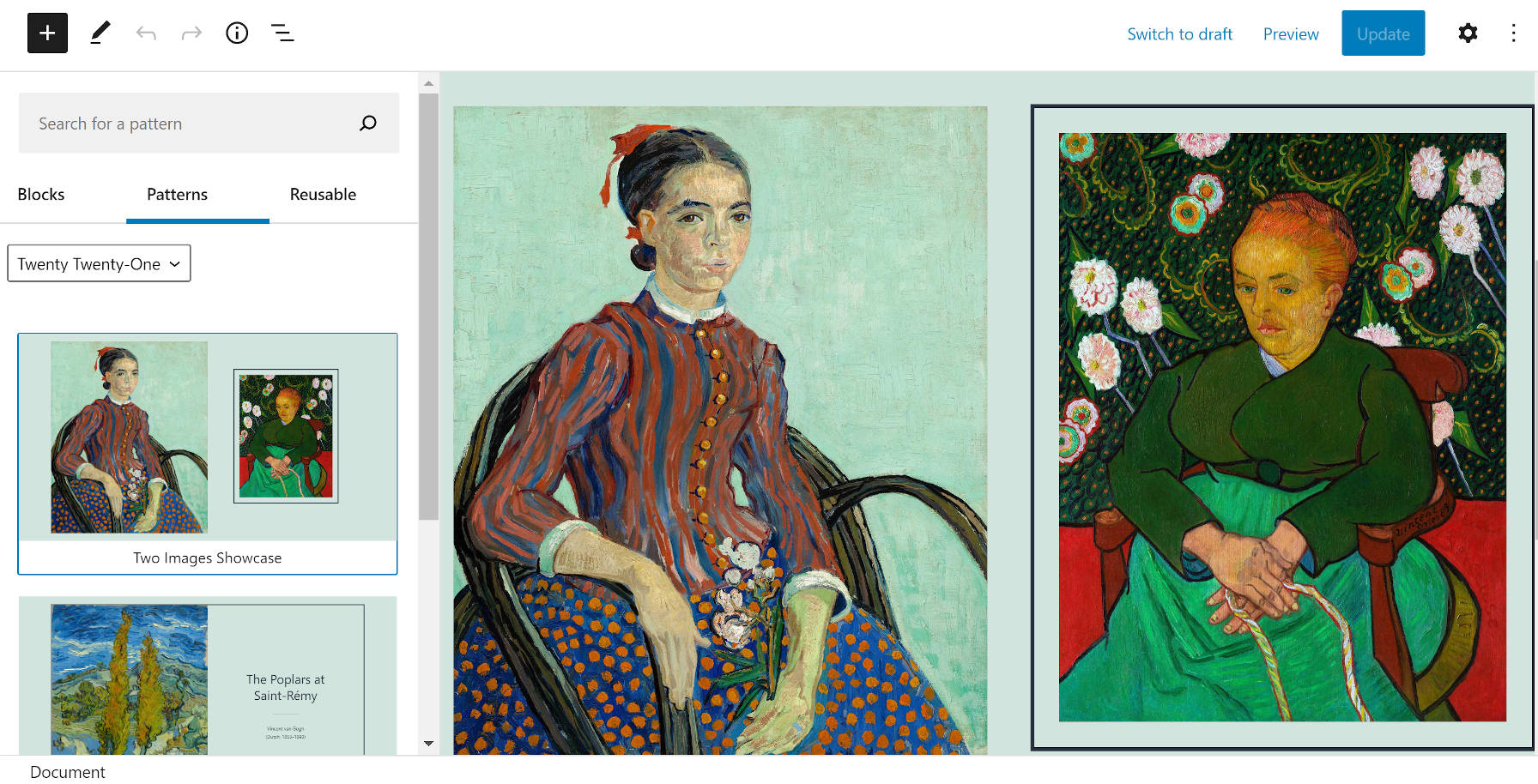
I have been calling for the return of the tabbed pattern categories since Gutenberg 8.0, which was a regression from previous versions. For 11 versions, users have had to scroll and scroll and scroll through every block pattern just to find the one they wanted. The development team has sought to address this issue by using a category dropdown selector. When selecting a specific category, its patterns will appear.
At first, I was unsure about this method over the old tabbed method. However, after some use, it feels like the right direction.
As more and more theme and plugin authors add block pattern categories to users’ sites, the dropdown is a more sensible route. Even tabs could become unwieldy over time. The dropdown better organizes the list of categories and makes the UI cleaner. More than anything, I am enjoying the experience and look forward to this eventually landing in WordPress 5.6 later this year.
Customizer Widgets Reverted

On the subject of WordPress 5.6, one of its flagship features has been hitting some roadblocks. Block-based widgets are expected to land in core with the December release, but the team just reverted part of the feature. They had to remove the widgets block editor from the customizer they added just two major releases ago.
It was for the best. The customizer’s block-based widgets editor was fundamentally broken. It was not ready for primetime and should have remained in the experimental stage until it was somewhat usable.
“I will approve this since the current state of the customizer in the Gutenberg plugin is broken, and there is no clear path forward about how to fix that,” wrote Andrei Draganescu in the reversion ticket. “With this patch, the normal widgets can still be edited in the customizer and the block ones don’t break it anymore. This is NOT to mean that we won’t proceed with fixing the block editor in the customizer, that is still an ongoing discussion.”
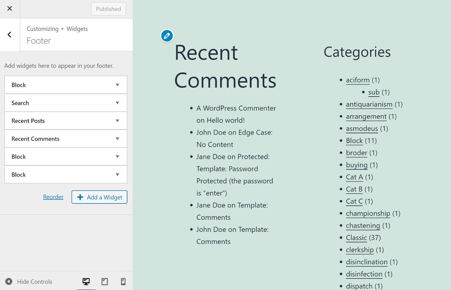
The current state of editing widgets via the customizer is at least workable with this change. If end-users add a block via the admin-side widgets editor, it will merely appear as an uneditable, faux widget named “Block” in the customizer. They will need to edit blocks via the normal widgets screen.
There is no way that WordPress can ship the current solution when 5.6 rolls out. However, we are still two months out. This leaves plenty of time for a fix, but Draganescu’s note that “there is no clear path forward” may make some people a bit uneasy at this stage of development.
Control Image Size for Media & Text

One of the bright spots in this update is the addition of an image size control to the Media & Text block. Like the normal Image block, end-users can choose from any registered image size created for their uploaded image.
This is a feature I have been looking forward to in particular. Previously, using the full-sized image often made the page weight a bit heftier than necessary. It is also nice to go along with themes that register sizes for both landscape and portrait orientations, giving users more options.

