Gutenberg 9.5 Improves Site Editor and Adds New Options for Cover and Code Blocks
Gutenberg 9.5 went live today. The development team is continuing forward with work that we will start seeing down the road in WordPress 5.7 and beyond. The big user-facing highlights for this release were the additions of a full-height alignment option for the Cover block, font-size support in the Code block, and improved previews for block patterns.
The majority of users will not see most of the work that went into the 9.5 release. The team addressed dozens of bugs and enhancements for the full-site editing feature. To test them, users must be using a block-based WordPress theme, such as Twenty Twenty-One Blocks, Q, or Block-Based Bosco.
We are a long way from seeing a production-ready site editor, but it is nice to see the improvements with each major Gutenberg release, such as the ability to set a post’s featured image if it doesn’t exist. The new description, status, and theme admin columns for templates and template parts add useful information. And, the developer side of me is happy to see a new wp_theme taxonomy for grouping templates under the hood rather than metadata.
The development team has made progress on the Query block. It is probably the most important piece of the full-site editing puzzle, and its current state is still holding back movement on block-based themes. The block now sports a new “grid view” option. There is also a Posts List variation that sets up a default of listing blog posts and excluding sticky posts. This block variation is a step toward pushing third-party plugin developers into creating custom variations for their post types in the future, building from the example set by WordPress.
Full-Screen Cover Block

The Gutenberg team added a new Full Height Alignment toolbar option to the Cover block. This is an independent alignment option and does not interfere with the existing horizontal alignments.
When adding the Cover block to a post, users will see a new frame-like button in the toolbar. After clicking, it will automatically set the height setting in the block options to 100 vh, which is the full height of the browser viewport. This option is far more flexible than having users set a height with pixel units, which do not automatically adjust based on the visitor’s screen size.
By combining this new alignment with full-width alignment, users can create full-screen layouts with the Cover block.
The new toolbar control will likely land in other core blocks. The Media & Text block is another good use case. Plus, third-party plugin developers can integrate it into their blocks. As its use becomes more widespread in blocks, it will offer more robust design options for theme developers too.
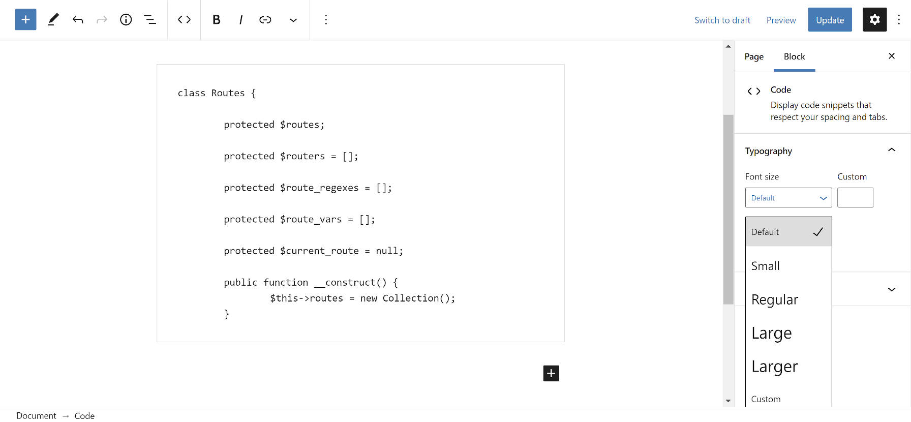
Change Code Block Font Size

The Code block now has the same font-size option as other text-based blocks, such as Paragraph and List. In general, users should probably shy away from adjusting this on a per-post basis and stick to the global default set by their theme or the Global Styles options when they eventually land in WordPress.
However, there are use cases where it makes sense to change the code font-size in particular layouts. I imagine some development-related site owners will want to highlight or showcase code in some way.
With that in mind, it would be interesting to see other design options brought to Code block. Currently, it does not offer much in the way of customization, but color and background options could allow users to spruce up their code examples a bit without relying on a third-party plugin for that extra bit of pizzazz.


