Gutenberg’s Custom Spacing Should Be Theme Controlled

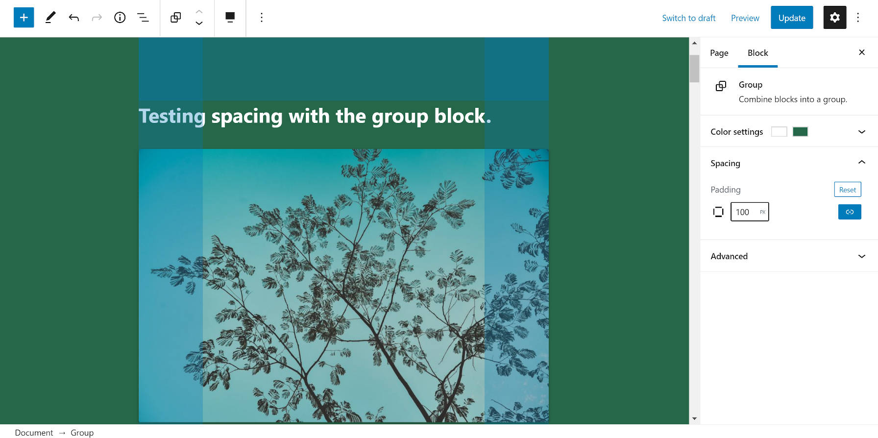
When Gutenberg 9.0 landed earlier this week, it came with an experimental padding control for the Group block. Most users will not see it unless their theme has opted into supporting the feature using the experimental-custom-spacing flag.
This was not the first that we have seen of the padding option on a block. Gutenberg 8.3 introduced it for the Cover block. Since then, nothing has changed with the implementation.
The problem with the custom spacing/padding option is that it creates an inline style that does not adjust based on the design of the theme. Fortunately, the feature is still experimental. This means that we have time to reevaluate how it works.
Unless we’re doing away with any remaining illusion that themes will play an important aspect of WordPress’s future and front-end design becomes fully entrenched within core, theme authors need some level of control. And, even if themes are going the way of the dinosaur, custom padding numbers on the block level will create design consistency issues down the road. Using 100 pixels of padding might make sense within a site’s current design, but 96 pixels might make sense within a future design. When a user adds dozens or hundreds of blocks with custom padding today, it will wreak havoc on tomorrow’s spacing and rhythm.
Besides that, the average user has little concept of design rules. Having a standardized system for spacing would give theme authors control over the output while giving end-users the ability to customize the look.
I have argued that WordPress needs some sort of design framework. For example, Tailwind CSS has specific padding classes. So does Bootstrap and nearly every other CSS framework. The web development community has been down this road. It is a well-trodden path, and WordPress is not innovating by using inline styles.
If the WordPress platform is going to put this sort of power into the hands of its users, it should do so in a way that allows designers to do their thing and not push users toward semi-permanent, inline-style soup in their content.
Pre-Gutenberg, I would have been entirely against the idea of WordPress introducing any sort of CSS or design framework. However, the platform is consistently moving toward becoming a UI-based design tool rather than simply a way to manage content. Users will have design-related options on a global scale all the way down to individual blocks. Users should absolutely have the ability to adjust a block’s padding in such a system. They should not need an understanding of CSS to do so. Instead, for most use cases, users should be able to adjust padding based on whether they want larger or smaller spacing, not specific CSS values.
I propose a full set of standardized padding classes. The same would go for margins or other design-related options down the road. Gutenberg/WordPress should create a set of default values for these classes, which theme authors could override based on their design.
This is not a new concept. Dave Smith, a developer for Automattic, introduced a patch in 2019 that used named selectors for spacing on the Group block. He gave the following reasoning for choosing this approach over absolute values:
Imagine you are a Theme designer. You craft your CSS with spacing that is perfect for the design. You want to ensure that is consistent throughout your Theme, even if the page layout is being created by the end-user in the Block Editor.
With the approach I’ve taken here, when a size is selected only classes are added to the Block in the DOM. This affords the Theme creator the opportunity to provide custom sizes in CSS that are suitable for their Theme. If they opt not to do this then sensible defaults are provided.
With the pixels approach, we’re locking users of the Block into absolute values and asking them to make a lot of decisions that they’d probably prefer not to have to make. It could also lead to an inconsistent visual experience.
This ship has already sailed and sunk with custom colors and font sizes. Gutenberg had an opportunity to standardize class names for these options but left it to theme authors. As a result, there is no standard across the theme market, which means that choosing the “large” font size or the “blue” text color provided by the theme will likely not carry across to the user’s next theme. Now, we are on the cusp of far more design-related options as WordPress moves toward full-site editing. It is time to consider some standards on design-related class names and provide a framework that all themes can use.
Gutenberg could still provide a custom padding option just like it does for colors and font sizes. Users who choose to go this route would be making an explicit choice to work outside of the standard. But, let’s not go down this road of allowing users to set absolute spacing values as the default option.


