Identify and Select Blocks via the Wayfinder WordPress Plugin
Christopher John, a Seattle-based designer and UX engineer, released his first project to the plugin directory yesterday. Announced via Twitter to high praise, Wayfinder is a block outline solution for the WordPress editor.
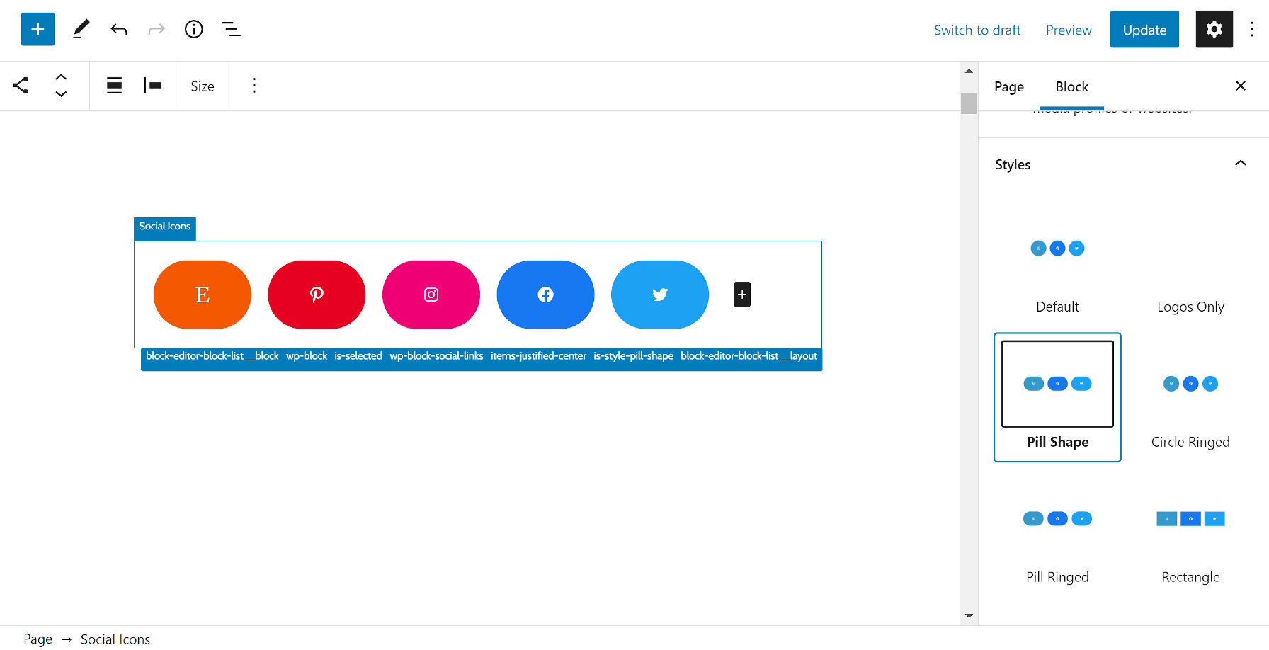
Like similar plugins, the goal is to make it easier for end-users to select nested blocks, which can sometimes be tough to pin down. Wayfinder outlines each block in the editor on hover. It then displays the block name at the upper left of the box.
My favorite feature that you will not find elsewhere is the addition of each block’s classes at the bottom right of the box. This makes it easy for designers or users who want to quickly find a class for styling.

Users can also enable or disable the pieces of the UI they want to appear via the plugin’s setting screen. However, any changes affect all of the site’s user experiences. Currently, there are no per-user settings.
At first glance, the plugin seemed to work great. The hover outline experience felt smooth, and I did not need to change the default options. Wayfinder almost seemed to be everything one might look for in a block-outline solution. It was besting existing plugins in nearly every way.
However, things soon began rolling downhill when writing a typical blog post with nothing other than Heading, Paragraph, and Image blocks. I first noticed that I could not type the same number of words as usual on one line. My perfectly-tuned typography was breaking sooner than it should have. Spacing between paragraphs seemed a bit too large. My wide-aligned images were just a little smaller than usual.
The user experience still felt good until this point, but the little oddities were stacking up. Something was not right. The plugin had been showered with praise on Twitter and already received three five-star reviews in its first 24 hours. Maybe my custom theme was the issue. However, similar problems arose when testing several others, such as Twenty Twenty-One, Nutmeg, and Eksell — each a well-rounded theme catered to the block editor.
As clean as the plugin’s UI is, it more often than not wrecks the theme’s default block spacing. This becomes more noticeable as users begin adding nested layers of blocks.
The problem is the plugin adds 18 pixels of padding around every block via its stylesheet.
.wp-block:not(.block-list-appender) {
    position: relative;
    outline: 1px dashed transparent;
    padding: 18px;
    overflow: visible !important;
}
To the untrained eye, this may not be a visible issue in many cases. It will affect each site differently, but 18 pixels of extra padding on every block will undoubtedly mess things up to some degree unless the theme itself uses that exact same spacing in its design.
The more noticeable issues are seen with blocks like Social Icons:

But, even something as basic as a List block can be misaligned:

Theme authors can write custom CSS to overrule the plugin’s padding. However, the last thing the WordPress community needs is a specificity war between themes and plugins. Themers already have to do this enough to wrangle blocks now.
Removing that one padding rule from the plugin’s editor-style.css killed 99% of its issues. Afterward, things were running like a well-oiled machine.
As a developer, I would explore outline-offset for spacing between the block and its outline, maybe cutting that 18px down a bit. Because outlines are not a part of the CSS box model, it would not affect spacing. Adjustments may be necessary on a per-block basis, especially when those blocks are nested or small (e.g., Social Icons, Navigation). It would carry its own challenges but should be a less destructive course.
To a lesser extent, the plugin’s overflow rule breaks the theme design from time to time. Its position and outline rules could overrule some edge-case block styles too, but they are necessary for the plugin to actually do its job. In particular, I could see positioning being problematic with sticky headers as we get into site editing.
The only other issue might be themes that use ::before and ::after pseudo-elements on blocks, but the plugin also needs to overwrite those to display the block name and classes list. This is likely another edge case.
Despite the issues, the plugin is ahead of the pack at this point.
Gutenberg Editor Full Width Blocks Border (a bit of a mouthful), another recent plugin to offer similar functionality, breaks custom theme design across the board. It does accomplish the job of making blocks easier to select, but the sacrifice of a WYSIWYG is not worth it.
The Editor Block Outline plugin has been my go-to recommendation for a while. It has a few design issues of its own, but some of those are adjustable on a per-user basis. However, as of late, it has made the editor feel sluggish. Plus, its misuse of the WordPress admin notice system for Twitter followers makes it something I’d prefer to steer clear of.
EditorsKit has a similar “block guidelines” feature that uses a box-shadow instead of padding and an outline. It does not muck up most theme layouts with that technique. However, I have hit other style conflicts with the plugin. Plus, EditorsKit is overkill for users who simply want just one feature.
That leaves us with Wayfinder. Warts and all, it is the best standalone option right now. Maybe that’s not saying much, but it is saying something. This is a feature that is hard to nail down. I do not envy the developers who are trying to make miracles happen.
It is sure to please many who have been on the lookout for a block outline solution. It is in a position to pull farther ahead of the competition with its relatively solid first outing. With more thorough theme testing and a bit of adjustment to its approach, it could be even better. I am eager to test future iterations.


