Simple Photoblogging with the Instapress WordPress Theme
It is not often that I come across a free WordPress theme that instantly impresses me. Far too often, I spend half an hour or more just getting to know a theme, checking its options, and figuring out how long it will take to recreate something that looks remotely like the demo. However, every now and then I come across one of those diamonds in the rough that makes me a taker a deeper look.
Instapress is one of those themes. It is yet another reason I am in favor of a curated featured themes list. These types of unique themes tend to get lost in the crowd, and without the backing of a major company to market them, they usually go unnoticed by most WordPress users.
What drew me to Instapress was its take on presenting posts on the front end. It is a photoblogging theme that is mostly good at showing individual photos but little else. It also has some of the old-school simplicity from the early WordPress theme era.
Instapress is the first and only theme that Anton Lukin has submitted to the official WordPress theme directory. He runs the theme on his personal blog, in which he shares photos from the places he travels.
Beautiful Simplicity
The theme is truly a photoblogging-only theme. It is not ideal for long-form, textual content or many other types of sites. Fair warning: if your plan is to do anything other than post photos, you should look elsewhere.
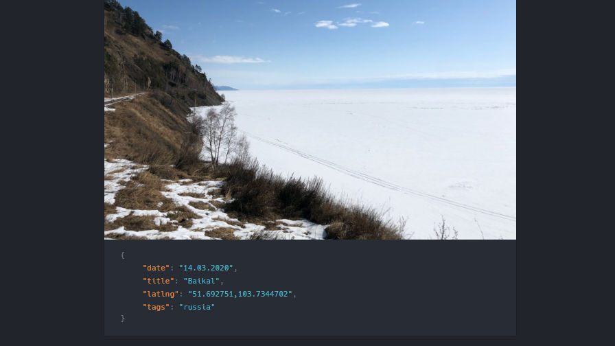
This narrow design is what makes the theme stand out. On the blog page and other archive-type pages, the theme presents the featured image with an interesting JSON-style output of the post metadata such as the date, title, and author.

Instapress has a few customizer options. Along with a custom footer description, end-users can decide whether to show the post author and any custom meta in post summaries on blog and archive pages. Custom meta in this sense means all public custom fields, which may not be desirable for everyone, depending on what metadata is assigned to the post. However, it can be useful for photobloggers who include location data, such as latitude and longitude for their posts.
As shown in the following screenshot, Lukin includes the coordinates on his post (latlng):

Themes rarely get much simpler than Instapress. It is intentionally lightweight. The stylesheet comes in under 20 kb, which is what any photoblogger should look for in a theme. The theme should not be the bottleneck for page speed on image-heavy websites.
Areas to Improve
While being a fan of the theme, some small things could drastically improve its appeal to end-users. I would not want the theme to add too many extra options. Its simplicity is part of its charm. However, a couple of home/archive views that offer a wider photo layout or grid would add a nice touch without bloating the theme.
Typically, I would deduct massive points for a theme that has no block editor styles, particularly in 2020. It is such a huge user base to leave out. But, the biggest loss for this theme is not taking advantage of the built-in, image-related blocks. They provide theme authors with a ton of design freedom. Throw in a few custom styles and you can do something special for photoblogs. Even just supporting wide and full-width alignment goes a long way in providing users better options for photos.
The other missing piece of the puzzle for this theme is that it has no site title output. End-users can shoehorn it into the nav menu or customizable footer description, but it would be nice to see it as part of the theme header, even if disabled by default.


