Gutenberg 10.2 Adds Spacers To Navigation Lists, Lets Users Categorize Template Parts, and Introduces Scoped Patterns
Yesterday, version 10.2 of the Gutenberg WordPress plugin landed. Users can now add a Spacer block between Navigation items, categorize custom template parts, and pick between patterns when inserting the Query block.
The user experience continues to improve in some areas. The Media & Text block, one of the few holdouts, can now be transformed into Columns. The transformation results in two columns with the media and the text separated. This is a one-way transform, however. It is a necessary enhancement for users who write out their text column to realize they can only add uploaded media instead of something like a YouTube embed to the Media & Text block. Making a quick switch over to Columns solves the issue.
The “Start writing or type / to choose a block” prompt only appears for the first empty paragraph when there are subsequent paragraphs. It is a trivial change, but it removed a minor annoyance.
The development team squashed 30 bugs for Gutenberg 10.2. They also continued work toward improving experimental features such as the site editor, global styles, and block-based nav menus. Full Site Editing is shaping up, but it will still be a while before we know whether it will be ready for inclusion in WordPress 5.8.
As I write this post, I am also doing so in a broken editor. Gutenberg 10.2, yet again, changed either its markup or CSS, which means I will have to do some digging to find out why all of our paragraphs are misaligned in the editor. But, that is a job for tomorrow. This should be a theme-specific fix and an isolated issue.
Nesting Spacer Blocks Within Navigation Lists

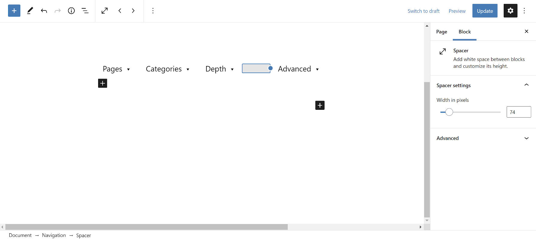
In one of the worst ideas the Gutenberg project has brought us, users can now insert spacer blocks between horizontal Navigation block items. And they can increase or decrease the space in pixels. The idea of spacing is not in and of itself bad, but the solution used is.
As far as I know, the <div> tag is not allowed as a direct child of <ul>. That is where <li> elements go. Maybe it is my old-school HTML upbringing, but it does not feel right to throw other things in the mix. List items are the children of lists.
Fortunately, there are solutions for this sort of horizontal spacing that have been available to web designers for decades: margin and padding.
The Spacer block has never felt right since it was introduced into Gutenberg. I always assumed it was an unfortunate stopgap solution for vertical spacing until we got proper margin and padding block options. I never imagined we would find new and inventive ways to use it for defiling a site’s markup.
Template Part Categories

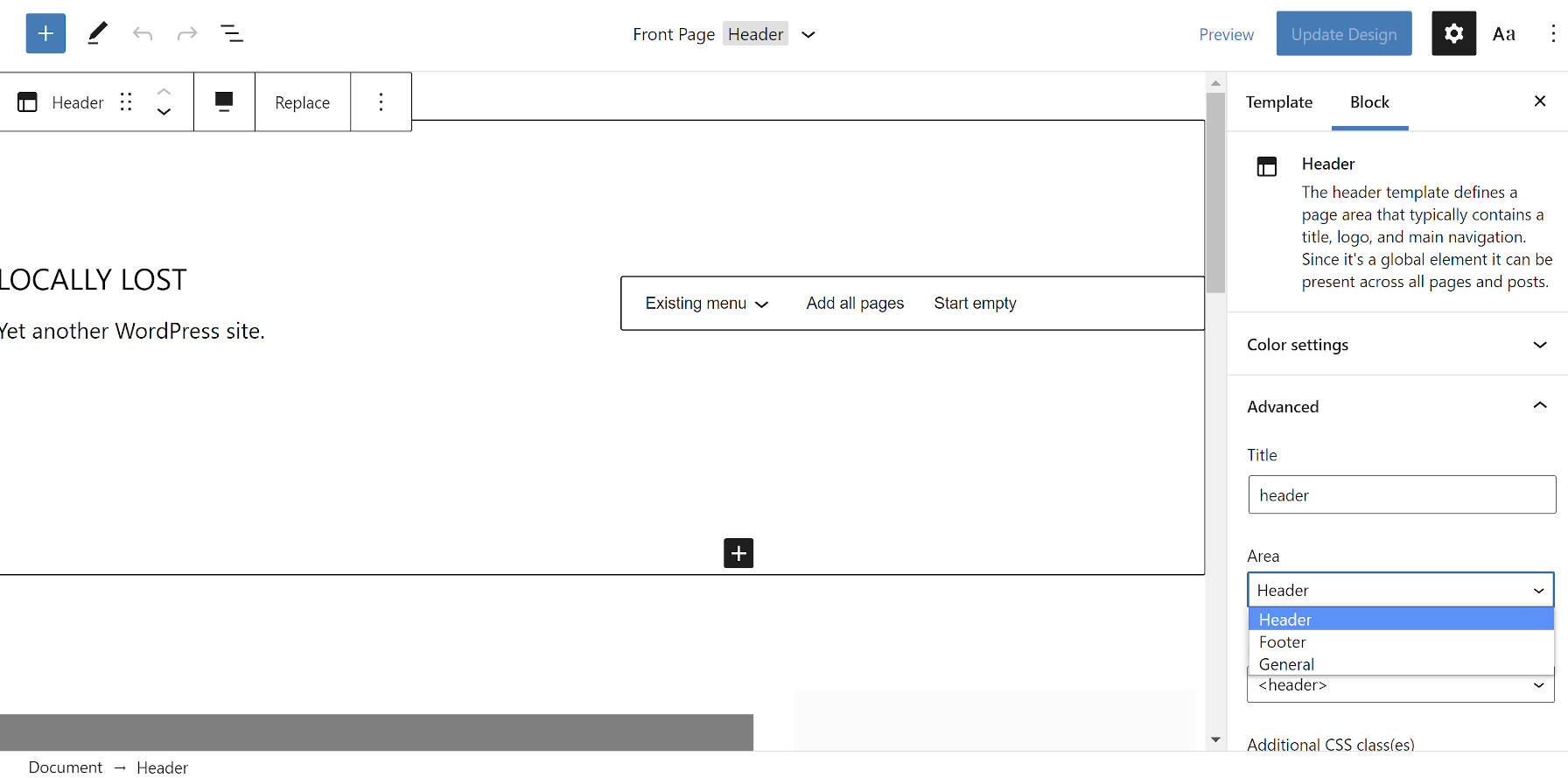
Users can now save template parts to a specific category or “area,” as they are called in the site editor UI. In Gutenberg 10.1, the development team introduced a new categorization system for theme authors that would automatically place template parts into the Header, Footer, Sidebar, or General categories. The same system is now open for user-created template parts.
When saving a template part via the site editor, users must open the “Advanced” block tab. There is a new “Area” option. The Sidebar category is missing in this release. Nevertheless, it is a welcome step toward template-part management.
Query Block Patterns

The Query block is at the heart of Full Site Editing. It will eventually be one of the primary components both developers and users interact with as they build sites.
The development team introduced a new concept for end-users when first inserting the Query block. In the past, users saw several block variations. Now, they can choose between patterns that are specific to the block.
Out of the box, there are Large, Medium, and Small patterns. Users can also opt to start from a blank slate.
For developers, this change introduces scoped patterns. It is a new layer to the Block Patterns API that should offer a ton of flexibility in the long run. While the feature only works with the Query block right now, theme and plugin authors could create predefined layouts for blocks that users can choose from in the future.
Imagine having several different styles of post loops that you want to offer to your users. With a few lines of code, you could register each of these as selectable Query patterns.
The new part of the API adds a scope argument that looks like:
'scope' => [
        'inserter' => false, // Whether to show in the main block inserter.
        'block'    => [ 'core/query' ] // The container block for the pattern.
]
This is still in the experimental stage, so things could change as the feature is further developed.
Following the core example, I created a quick Query pattern with the following code:
add_action( 'init', function() {

	register_block_pattern(
		'tavern-query',
		[
			'title'  => 'Tavern Query',
			'scope'  => [
				'inserter' => false,
				'block'    => [ 'core/query' ],
			],
			'content' =>
                '<!-- wp:post-title {"isLink":true} /-->
				<!-- wp:post-featured-image {"isLink":true,"align":"wide"} /-->
				<!-- wp:post-excerpt /-->
				<!-- wp:separator -->
				<hr class="wp-block-separator"/>
				<!-- /wp:separator -->
				<!-- wp:post-date /-->'
		]
	);
} );


